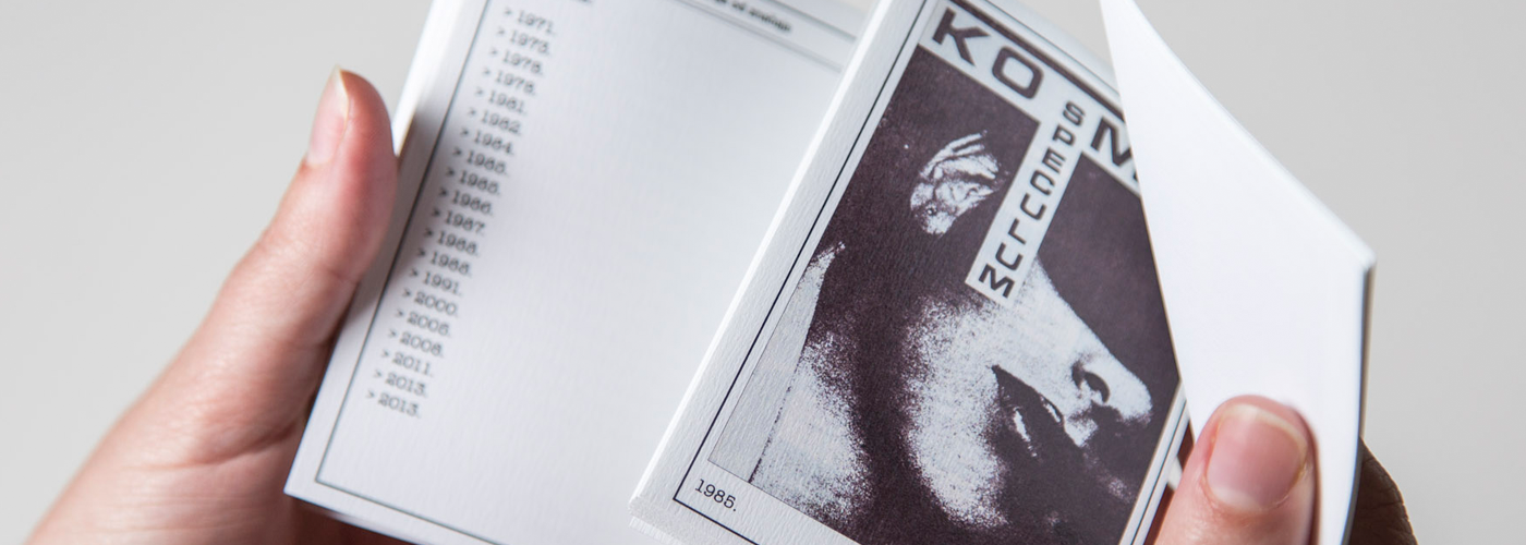
The Faculty of Medicine of the University of Rijeka employed Kombinat to create an exhibition and design and write a catalogue for the celebration of 40 Years of Speculum. The exhibition was opened on the 14to of December, 2014, and it featured twenty front pages of the student magazine Speculum, published from 1970 to 2014. The choice of (only) twenty front pages was not an easy task, considering Speculum has been going out for four decades. Our choice was guided by creative innovations in the design of the front page, namely parameters such as typography, composition or format. Even though Speculum was an amateur magazine in the artistic sense, each of the chosen front pages reveals a certain spontaneous, engaged and critically-shaped moment. The chosen editions of Speculum, aside from covering specific themes, skillfully communicates student issues and preoccupations of the time, thus articulating certain characteristics of use and needs of the users (primarily, students of the Faculty of Medicine in Rijeka). Designer practice should be a result of listening to exactly those real needs. The front pages on the display, and the editions they stand for, are evidence that outsiders to a professional design community and their spontaneous choices can contribute to the bulk of what we call good (amateur) design.
Exhibition Concept
The front pages of Speculum were hung with clothespins on hangers hung on metal clothes racks. A doctor’s coat was hung on each of the hangers and a front page was hidden underneath it. Since every front page is visually specific, we thought we’d give each coat a different characteristic (for instance, a stethoscope around the neck, or a test tube in the pocket).
Also, given the mentioned distinctiveness of each of the front pages, the minimalistic uniformity (the simplicity of white doctor’s coats and metal clothes racks) tied the whole story neatly together, allowing for the front pages to stand out, which was the goal of the exhibition.
The new edition of Speculum was promoted at the exhibition, which then functioned as a promotion of the magazine as well. The copies of the new edition of Speculum were exhibited on the hospital bed covered with a bed sheet with a hole in the middle out of which the visitors could pick out their copy of the magazine thus making the exhibition interactive and establishing a successful communication with the visitors.
Catalogue
The exhibition catalogue was designed to resemble an old health booklet – the fonts used and the arrangement of elements mostly correspond to it, and as such call to mind a socialist design. Even though two fonts are used, the typewriter font is primarily noticeable since this was the font with which the patient data was written into the health booklets. 20 front pages of Speculum are stapled inside the catalogue, serving as medical test results that used to be placed inside health booklets in such a way. Each catalogue thus becomes a dossier of the patient – Speculum – featuring the complete history of disease – its anamnesis.
The project was financed by the Student Cultural Centre of the University in Rijeka.
/// KombiCut ///
Lea and Mirna have taken Speculum in their hands for the first time (aka the instrument for the observation of openings in the body).


