The Museum of the City of Rijeka, The Maritime and History Museum of the Croatian Littoral, Natural History Museum Rijeka and the Museum of Modern and Contemporary Art collaborated on a project called Museums Together in the summer of 2014 as a part of the program of candidacy of the City of Rijeka for the European Capital of Culture 2020. The goal of this collective action was to promote the city and its cultural and art programs as well as straightening the international orientation and visibility of both Rijeka and Primorsko-goranska County.
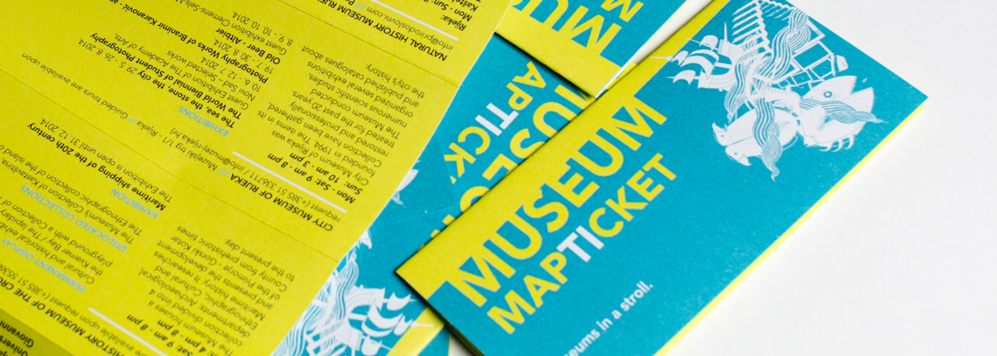
Kombinat was asked to design the promotional poster and a museum ticket – a single common ticket that would allow one to visit all four aforementioned museums in Rijeka. The design of the poster and ticket (named map-ticket) featured fresh and joyous colours which symbolise a relaxing but contentful summer of museums. The combination of lemon-yellow and turquoise blue invites the consummation of cultural contents which are all too often associated with a boring, stale, (institutional) brown colour.
The poster and the ticket are essentially maps. The form makes it easier for a visitor to find her or his way around, and it emphasises that the museums are all quite close to each other, thus making use of the obvious locational advantage – all four museums are in the centre of the city.
Each museum on the map is illustrated symbolically according to the field of its research. Each illustration, aside from the particular element (describing the museum), also contains a line, or more precisely a wave, suggesting a sea city, a port city. The wave also symbolises the collaborative effort of the museums by appearing on each particular illustration.
The four illustrations are made up of two or more interconnected elements that are stylized into a sign, thus simplified and reduced to essential features, while the choice of motives reflects the collection of the particular museum. Illustrations are similar to those on playing cards in the way that they can be observed from two opposite sides of the map. The design aimed to emphasise additionally that the map-ticket is functionally both a map and a ticket. When put together, its shape resembles a ticket, and when spread open, it becomes a map of all museums. A special attention was payed to the folding itself – at each fold, the location of the museum is connected to his program, which makes finding the museums easier, and visiting it more likely.
/// KombiCut ///
Mirna: Just one more correction.
Lea: No more changes.
Anja: Just one more, come on – I promise this is the last one.(every designer knows that the last correction is definitely not the last correction)

